
An example of the cut off, ugly text in the store (look at “Sign In” and “Welcome”):

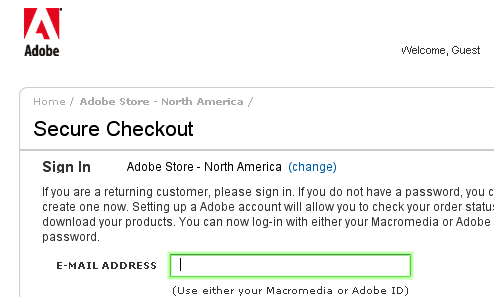
An example of the cut off, ugly text in the store (look at “Sign In” and “Welcome”):

After spending a frustrating day yesterday working with a client, their web site overload issues, and the hosting “advanced support” I am worn out. The issue: extremely high traffic database driven web site – when moved into the production environment on a dedicated server – would spike the processors’ load to 100% and would then […]
I am not sure if anyone else caught the Ninja Warrior but I was pretty worthless between that and having out of town guest here (who I also made them watch it too). This show contains so many great qualities: impossible obstacles, stories of the competitors and one really excited announcer. I am so happy […]


Doug Blatti
I agree. Their site is always painful. Maybe they use GoLive to make their site.
jenz
Good ol’ GoLive…long live the app that I loved for so long…